nen
Varga Girl Design was engaged to create new branding for nen–an environmental verification system for international commodity trading companies.
The Challenge
We were on the clock and on a short deadline. nen quickly needed new branding to file a certification within 2 weeks. Our immediate time-sensitive task was to design a logo. It had to be simple, sophisticated and in colour, while working in black and white as well. The new logo needed to evoke ideas of nature, change/evolution and supply chains.
The client asked, “I know that doing things this way around makes life difficult and that the timeline for this first objective is aggressive but do you think you could manage it?” Our answer? “Hell yeah!”
The Solution
Our first step was to present mood boards. This is a great way to identify the possible directions for the colour scheme, fonts and general ‘flavour’ of the design.

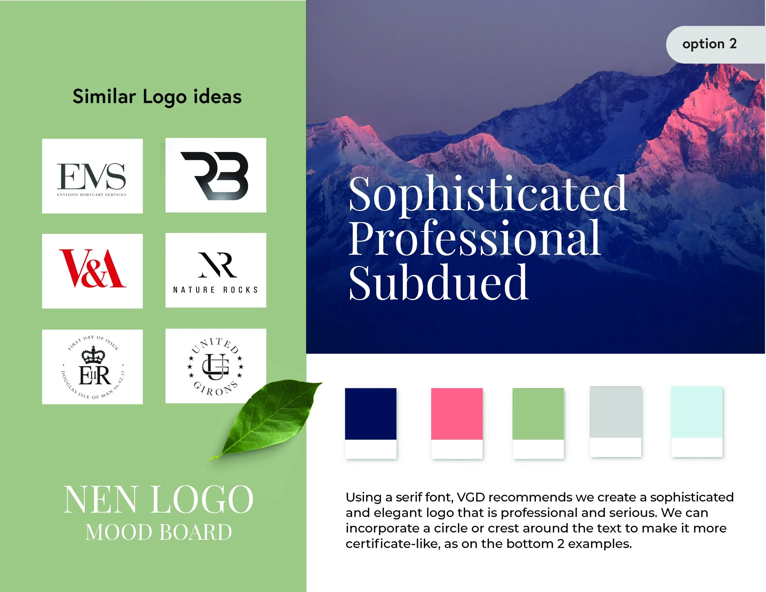

The Branding
The client felt the strongest connection to option 2–the more sophisticated board. With that, we were off! Within a few short iterations, the new corporate logo, as well as a ‘nen verified’ crest was created. We delivered the new logo in record time, (less than two weeks) and the client was ecstatic.